pi-slides-skill
pi coding-agent skill: research-backed, animated React web slide decks with automated review and PDF export.
Package details
Install pi-slides-skill from npm and Pi will load the resources declared by the package manifest.
$ pi install npm:pi-slides-skill- Package
pi-slides-skill- Version
0.11.0- Published
- Nov 19, 2026
- Downloads
- 409/mo · 43/wk
- Author
- jasonli0226
- License
- MIT
- Types
- skill
- Size
- 685.2 KB
- Dependencies
- 0 dependencies · 0 peers
Pi manifest JSON
{
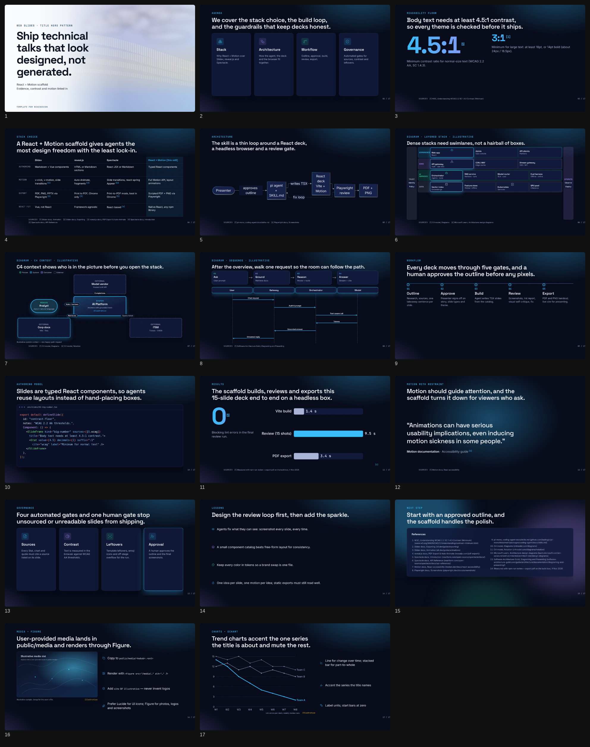
  "image": "https://raw.githubusercontent.com/jasonli0226/pi-slides-skill/main/examples/screenshots/contact-sheet.png",
  "skills": [
    "./skills"
  ]
}
Security note
Pi packages can execute code and influence agent behavior. Review the source before installing third-party packages.
README
pi-slides-skill
An agent skill for the pi coding agent that builds stunning, research-backed web slide decks. Decks are React 19 + Vite + Motion apps on a 1920×1080 stage. Every slide is screenshotted and linted automatically, and the deck exports to PDF and PNG.
Official example in the midnight theme, with motion:

The same official example in the paper (light) theme:


What it does
- Workflow: brief → research → editable design spec (
content/deck.spec.yaml) → your approval → build from spec → screenshots → self-review checklist → PDF export. Regenerating stubs does not wipestatus: lockedslides. - A deck standard enforced by code, not just by instructions:
- Every Stat, chart or quote must cite a source listed on its slide.
- Titles must be full-sentence takeaways.
- Contrast is checked against WCAG 2.2 AA, both at the token level and in the rendered DOM.
- The lint fails on emoji icons, template leftovers (lorem, TODO,
{{ }}, NaN), overflow and text under 18px. - The lint warns when a slide stacks more than one hero effect (count-up Stat, glow background, gradient text).
- Charts are checked against the chart guide: no pie or 3D, at most 5 series with the title's series highlighted, bar axes from zero, no unjustified dual axes.
- 13 slide types with working examples: title, agenda, big number, architecture (Mermaid or React swimlanes / C4 / sequence), comparison, timeline, code walkthrough (Shiki with per-step focus), quote, results (count-up stat + animated bars, or an EChart trend), governance, lessons, closing and section.
- Charts:
BarChartfor simple comparisons, plus<EChart>for trends, stacked part-to-whole, distributions, scatter, sankey and heatmaps. ECharts is tree-shaken and loaded only on slides that use it, renders as SVG (selectable text in the PDF), and takes its colors and fonts from the theme tokens.skills/web-slides/references/chart-guide.mdmaps the story to the chart type. - Diagram guide:
skills/web-slides/references/diagram-guide.mdteaches when to use Mermaid (≤8 nodes) vsLayeredArchitecture,FlowSteps,Sequence,C4Container(React + CSS, no heavy graph library). - Layout guide:
skills/web-slides/references/layout-guide.md— presentation Flexbox + Grid recipes (KPI strip, compare, hero+chart), overflow rules; cites CSS Tricks Flexbox/Grid. - Design spec:
skills/web-slides/references/deck-spec.md— YAML middle layer (slide types, layouts, components, chart data, notes) with approval gate and promote/merge rules;npm run specvalidates and generates stubs. - Media guide:
skills/web-slides/references/media-guide.mdteaches the agent to copy user-provided logos/screenshots intopublic/media/and render them with<Figure>(alt + cite/illustrative, lint for missing alt / broken src). - Swappable theme tokens: built-ins
midnight,aurora,paper, plus inspiration presetstech-dark,bento-minimal,navy-pitch. A user brand goes inbrand.css. Prefer presets over re-scraping free packs (seedocs/template-inspiration.md). - Template inspiration: curated free tech Google Slides / PowerPoint packs (SlidesCarnival, Slidesgo, …) used as style references only — palettes + layout recipes via
style:images, never vendored PPTX. See docs/template-inspiration.md. - Style import:
npm run style:url -- <url>,style:images -- <dir>andstyle:svg -- <dir>turn a website, a mood board or SVG artwork intostyle-spec.jsonplus a WCAG-checked[data-theme="brand"]. The importer extracts colors, swaps proprietary fonts for free ones, maps layout feel to tokens and normalizes SVGs. It borrows style, never assets. - Style library (
skills/style-library/): save / list / apply / update named packs (theme tokens + React/CSS patterns such as title-hero, KPI, timeline). Apply wires packs into the deck build (brand.css,deck.spec.yaml, slide TSX), not onlystyle-import/.npm run style-lib -- list. - Slide reviewer (
skills/slide-reviewer/): afternpm run review, runnpm run critiqueto writereview/critique.md(overlap, density, weak titles, safe margins). Critique only — no auto-rewrite unless asked. - Presenting: arrow keys or clicks with click-steps, N notes, O overview, F fullscreen, and
prefers-reduced-motionrespected.
Install into pi
This repo is a pi package. package.json declares "pi": { "skills": ["./skills"] }.
# from npm
pi install npm:pi-slides-skill

# or from GitHub
pi install git:github.com/jasonli0226/pi-slides-skill

# or from a local clone
git clone https://github.com/jasonli0226/pi-slides-skill && pi install ./pi-slides-skill

# or copy only the skill
cp -r pi-slides-skill/skills/web-slides ~/.pi/agent/skills/web-slides
cp -r pi-slides-skill/skills/style-library ~/.pi/agent/skills/style-library
cp -r pi-slides-skill/skills/slide-reviewer ~/.pi/agent/skills/slide-reviewer
Add -l to pi install to write to the project's .pi/settings.json instead of ~/.pi/agent/settings.json. Then ask pi for a deck ("make a 10-minute deck on …"), or force the skill with /skill:web-slides. After editing the skill, run /reload.
Requirements: Node.js 20+, npm, and Chromium for Playwright (npx playwright install chromium, or set CHROME_PATH).
Use the scaffold directly
node skills/web-slides/scripts/new-deck.mjs ./my-deck --title "Our pilot cut triage time in half." --theme midnight
cd my-deck && npm install && npx playwright install chromium
npm run dev          # present mode + HMR — edit slides, browser updates live
npm run live         # HMR + watch content/deck.outline.md → generated stub slides
npm run outline      # regenerate outline stubs once (no Vite)
npm run spec         # validate content/deck.spec.yaml + generate stub slides (status:stub only)
npm run review       # screenshots + lint → review/ (contact-sheet.png, report.md)
npm run export:pdf   # export/deck.pdf   (add -- --raster for a pixel-exact PDF)
npm run verify       # tokens + typecheck + build + review + pdf, exit code for CI
Develop this repo
npm test              # scaffold smoke, token checks, present-mode, style-lib, critique
npm run style-lib -- list
npm run critique -- --deck <deck-dir>
The tests scaffold decks into a temp dir and run npm ci there, so they need network or an npm cache, plus Chromium for Playwright. CI runs them on Node 20, 22 and 24.
Repo layout
package.json                     pi package manifest (`"pi": { "skills": ["./skills"] }`)
skills/web-slides/               deck builder skill
  SKILL.md                       entry point pi loads (frontmatter + workflow + standard)
  references/
    design-guide.md              story, layout, type scale, color, icons, motion, data
    layout-guide.md              Flexbox + Grid recipes for the 1920×1080 stage
    deck-spec.md                 editable YAML design spec + approval / promote rules
    diagram-guide.md             scenario → diagram type, beauty rules, anti-patterns
    slide-catalog.md             slide types, component props, file skeleton
    workflow.md                  step-by-step commands and approval gate
    style-import.md              URL / images / SVG → brand theme, font swaps, licensing
    media-guide.md               user logos/screenshots → public/media + <Figure>
    review-checklist.md          automated + visual + facts checklist
  fixtures/style-import/         generated CC0 sample images + SVGs for the importers
  scripts/new-deck.mjs           create a deck from the template
  template/                      the deck engine + example slides + live outline
    src/deck/                    Deck (modes, keys, transitions), components, CSS
    src/theme/tokens.css         all design tokens + 6 themes (3 core + 3 inspiration presets)
    src/theme/brand.css          where the brand theme goes
    src/slides/                  one file per slide, sources.ts bibliography
    content/deck.spec.yaml       editable design spec (approval artifact)
    content/deck.outline.md      optional light outline (titles/bullets)
    scripts/                     review, critique, live, spec, watch-outline, export-pdf, check-tokens
    scripts/style/               style:url, style:images, style:svg (+ shared color/k-means lib)
skills/style-library/            named style packs (theme + component patterns)
  SKILL.md                       save / list / apply / update workflow
  references/                    pack schema, workflow, examples
  scripts/style-lib.mjs          CLI: save | list | apply | update | show
  styles/                        shipped example packs (title-hero-light, navy-pitch-snapshot)
skills/slide-reviewer/           screenshot critique phase (no auto-rewrite)
  SKILL.md                       critique workflow after npm run review
  references/critique-rubric.md  blockers / warns / finding template
  scripts/critique.mjs           → review/critique.md
test/                            scaffold smoke, check, present-mode, style-lib tests
docs/research.md                 stack comparison, decision, sources
docs/verification.md             what was run and the results
docs/template-inspiration.md     free-pack inspiration → presets (not vendored PPTX)
docs/diagram-evidence-plan.md    plan for source-backed diagrams, validated IR, and path walk (v1 implements this slice)
examples/                        example-deck.pdf, review-report.md, screenshots/
Live mode
React slides stay the source of truth. For real-time updates:
npm run dev— Vite HMR present mode at http://127.0.0.1:5173. Change any slide TSX, theme token, or diagram component and the stage refreshes immediately.npm run live— same server, plus a watcher oncontent/deck.outline.mdthat rewritessrc/slides/generated/from-outline.tsx. Uncomment theoutlineSlidesimport and the...outlineSlidesspread insrc/slides/index.tsto see stubs in the deck; then promote each stub into a hand-crafted slide file (diagrams, motion, layout) beforenpm run review.
Caveat: the outline → TSX path is intentionally thin (title + bullets). It will not invent C4 / swimlanes / charts. Beauty work stays in React.
Research summary
We compared Slidev, reveal.js, Spectacle and a custom React + Motion scaffold (details in docs/research.md).
- Chosen: custom React + Vite + Motion. The brief asked for React. Plain TSX components give agents complete layout and animation freedom with well-known libraries. Our own URL modes (
?static,?print) make Playwright screenshots, DOM linting and PDF export deterministic, which is what lets the agent review its own work. - Runner-up: Slidev (Markdown + Vue). It has the richest built-ins: PPTX/PDF/PNG export via Playwright, presenter mode and Shiki Magic Move. Its plain PPTX export is images, and even
pptx-editablekeeps SVG/Mermaid as pictures. - reveal.js has Auto-Animate and fragments, and its
?print-pdfexport is documented for Chrome/Chromium. Spectacle is React with atransitionprop, react-spring Appear/Stepper, and a print mode whose custom page size works fully only in Chrome. - Accessibility: WCAG 2.2 SC 1.4.3 requires 4.5:1 contrast (3:1 for large text). Motion's
reducedMotion="user"turns off transform and layout animation for users who request it.
Sources
- Slidev: Animation, Exporting
- reveal.js: PDF Export, Auto-Animate, Code
- Spectacle: Introduction, API Reference
- Motion: React accessibility
- Playwright: Screenshots
- W3C: Understanding WCAG 2.2 SC 1.4.3
- pi-mono: skills.md, packages.md
Known limits
- The presenter view is an in-page notes overlay, not a separate presenter window.
- Chart text inside
EChartis SVG, so the contrast lint skips it like other diagram text; the colors come from theme tokens thatcheck:tokenscovers. - Automatic contrast checking covers text on solid or semi-transparent backgrounds. Gradient text and text over glows or images must be checked by eye (it's on the checklist).
- There is no editable PPTX output; hand-off is PDF and PNG.
- The vector PDF drops the grain overlay and renders gradient text in the solid accent color. Use
--rasterfor a pixel-exact copy. - The committed
brand.cssis empty. Generate one withnpm run style:*or write it by hand. - Style import is heuristic. A page with a full-bleed hero photo or video, or a cookie wall, can skew bg or accent detection, so check the spec against the captures. Sites that block headless browsers need a user screenshot passed to
style:images. SVG parsing is regex-based (no svgo unless installed) and does not resolve CSS classes in<style>blocks.
License
MIT