@d3ara1n/pi-ask-user
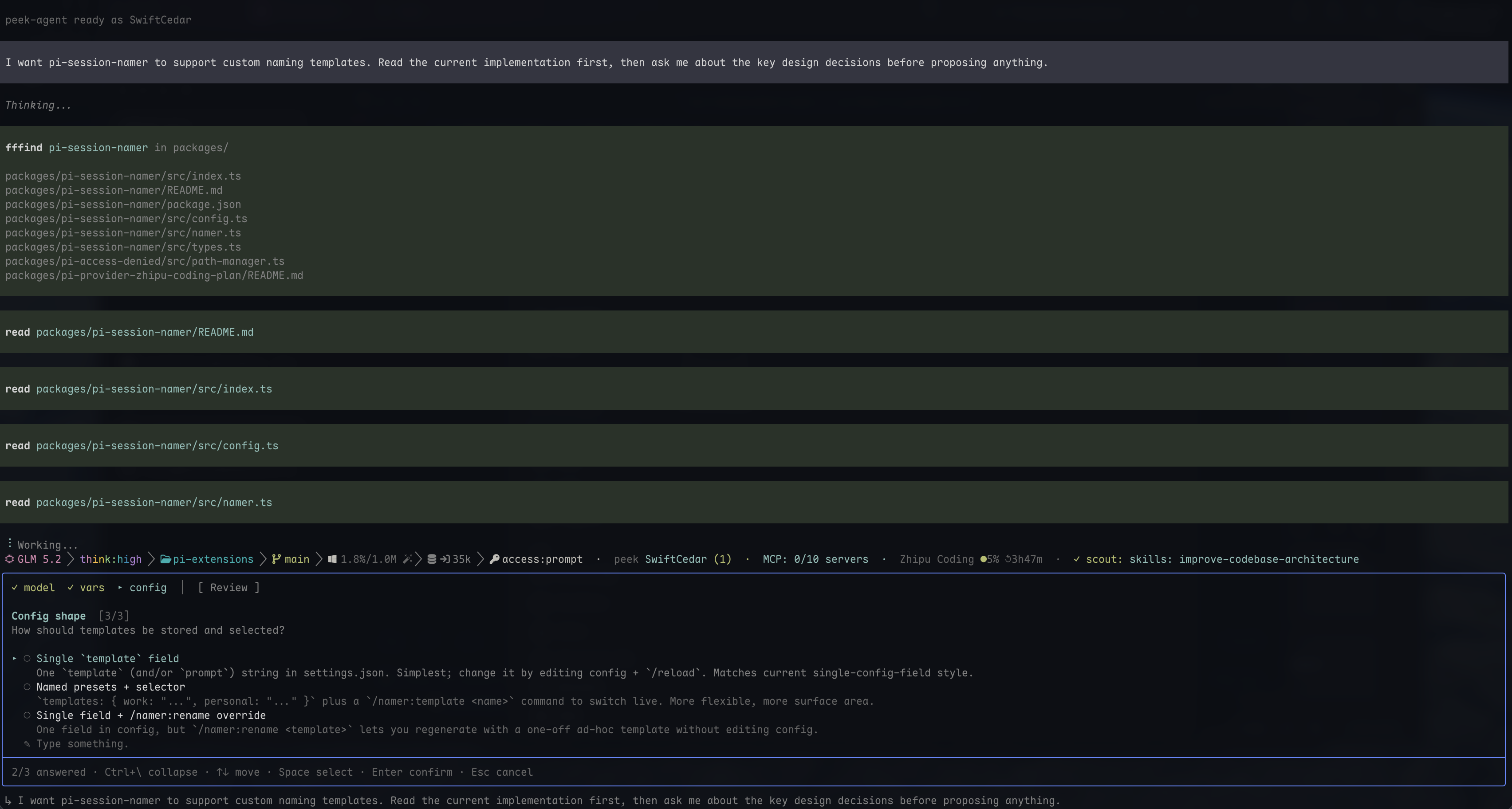
Ask-user tool for pi — renders in the bottom editor slot (not a screen overlay), so the transcript stays visible and scrollable above the panel while you decide
Package details
Install @d3ara1n/pi-ask-user from npm and Pi will load the resources declared by the package manifest.
$ pi install npm:@d3ara1n/pi-ask-user- Package
@d3ara1n/pi-ask-user- Version
2.2.2- Published
- Jul 12, 2026
- Downloads
- 1,521/mo · 92/wk
- Author
- d3ara1n
- License
- MIT
- Types
- extension
- Size
- 754 KB
- Dependencies
- 0 dependencies · 2 peers
Pi manifest JSON
{
  "extensions": [
    "./src/index.ts"
  ],
  "image": "https://raw.githubusercontent.com/d3ara1n/pi-extensions/main/packages/pi-ask-user/preview.png"
}
Security note
Pi packages can execute code and influence agent behavior. Review the source before installing third-party packages.
README
@d3ara1n/pi-ask-user
A collapsible ask-user tool for pi.
Why
Most ask-user tools render the panel as a screen overlay that covers the transcript, so you can't read the analysis that should inform your choice — you choose blind.
This tool uses overlay: false instead. The panel renders into pi's bottom
editorContainer slot (the same path ctx.ui.select() / ctx.ui.input()
take), so the transcript stays visible above the panel while you decide.
Scrolling, and the pi-powerline-footer caveat
Native pi writes every chat line to the terminal's normal scrollback (mouse
wheel / Shift+PgUp / Cmd+↑), so the transcript above the panel is always
scrollable.
pi-powerline-footer
changes that — once it's loaded the native scrollback stops working, so an
overlay-type ask-user panel is a dead end: it covers a transcript you
then can't scroll back through. This tool's overlay: false keeps the
transcript in the content area, so it stays visible and usable even
alongside pi-powerline-footer — exactly the case where overlay tools break.
- Collapse (
Ctrl+\) shrinks the panel to a single status row, leaving even more of the transcript on screen while you decide.
Tool: ask_user
{
  "questions": [
    {
      "header": "Which layout?",
      "tab": "layout",
      "prompt": "Pick the layout for the new settings page.",
      "options": [
        { "label": "Sidebar", "description": "Nav on the left…" },
        { "label": "Tabs", "description": "Top tabs…" }
      ]
    }
  ]
}
Fields
Question
| Field | Type | Required | Description |
|---|---|---|---|
header |
string | yes | Short title shown in the panel header |
tab |
string | yes | Short keyword identifying this question. Shown on the tab bar when there are multiple questions, and returned in the result as the answer's prefix. Write it in the user's language, not as a programmatic identifier. It should be unique across all questions in one call; if duplicates are supplied, results preserve question order as tab, tab-2, tab-3, … |
options |
array | yes | 2–4 options |
prompt |
string | no | Longer body text under the header |
multiSelect |
boolean | no | Check multiple options. Default false |
allowSkip |
boolean | no | If false, the user MUST answer before proceeding. Default true |
Option
| Field | Type | Required | Description |
|---|---|---|---|
label |
string | yes | Display label |
description |
string | no | Short explanation under the label (wraps). Add one when the label alone isn't self-explanatory |
preview |
string | no | Use when description (a short one-liner) isn't enough and the user genuinely benefits from more detail in a side column — ASCII layout demo, code skeleton, Pro/Cons breakdown, or the reasoning behind the option and what choosing it entails. Rendered verbatim. Don't treat it as extra text capacity — every line competes for the user's attention. If a short description already conveys the option, leave empty. Most options need only description |
Icons
All selection icons live in the U+25A0–25FF Geometric Shapes block, so any
font that renders one renders all of them consistently:
- Single-select:
○(white circle) →◉(fisheye) when committed - Multi-select:
□(white square) →▣(square with fill) when checked - Cursor:
▸marks the current position, independent of selection
Moving ↑/↓ only moves the cursor; selection is committed separately.
Single-select vs multi-select
- Single-select:
Spaceselects (fills the circle) without advancing;Enterselects and advances to the next question. - Multi-select (
multiSelect: true):Spacetoggles a checkbox;Entercommits all checked options and advances.
Custom input ("Type something.")
Every question always shows a "Type something." row (this cannot be turned off),
so the user is never locked into the provided options. Press Space on it to
open a text editor:
- After submitting, the row displays the committed text with a filled glyph
(
◉ ✎ your text). - Press
Spaceagain to re-edit it — the editor prefills the committed text so you can tweak it. Escdiscards the edit (the original answer is kept);Enterconfirms the change (the answer is updated).
Multi-select + custom input. In multiSelect mode the custom text is an
extra entry kept alongside the checked options — it never overwrites them.
You can check several options, then open "Type something.", type a value, and
submit: both the checks and the custom text are preserved and returned
together. The same holds in reverse — edit the question later from the review
screen to add or remove checks and the committed custom text stays intact
(and vice versa). Submitting an empty custom value clears only the custom
entry; any remaining checks are kept.
Required questions
Set allowSkip: false to force an answer. The user cannot advance forward
(Tab/→) until they answer; the built-in "Type something." row always lets
them supply a custom answer, so they're never trapped by options they dislike.
Backward navigation (Shift+Tab/←) is always allowed so they can review/edit
earlier questions.
Rich previews
description is the default way to explain an option; reserve preview for
the rare case where a description can't fully convey it. If any option of
a question carries a preview field, that question renders in two columns:
option list on the left, the focused option's preview on the right. Moving the
cursor updates the right pane. Ideal for comparing ASCII layouts / code samples:
{
  "header": "Which layout?",
  "tab": "layout",
  "options": [
    {
      "label": "Sidebar",
      "description": "Left-side navigation with the main content to its right.",
      "preview": "┌──┬────────┐\n│NA│  body  │\n│V │        │\n└──┴────────┘\nleft sidebar nav"
    },
    {
      "label": "Top bar",
      "description": "Top horizontal nav with the main content below.",
      "preview": "┌──────────────┐\n│    nav bar   │\n├──────────────┤\n│     body     │\n└──────────────┘\ntop horizontal nav"
    }
  ]
}
Plain description text (no newline) wraps normally. A description that
contains a newline renders verbatim as a fixed-width block.
Review screen
After the last question is answered, a review screen lists every question
and its answer (multi-select answers are comma-joined and truncated with …
when too long; skipped questions show (skipped)). Each question entry spans
two rows (header + answer), followed by a trailing note entry:
 ▸ 1. Which layout?
      Sidebar
   2. Which database?
      Postgres

   ✎  Note to assistant
      (optional — Space to add a note)
Each title carries a fixed-width marker (1./2.… for questions, ✎ for
the note) so every title aligns; the body is indented one level deeper to keep
header vs content visually distinct. An empty line sets the note apart from
the Q&A list above it.
↑/↓— move the cursor between entries (questions + the note)PgUp/PgDn— scroll by page (when there are more entries than rows)Space— edit the focused entry: a question (jumps to its tab; returns to review afterwards) or the note (opens a free-form editor)Tab/→— advance to the next tab (cycles back to the first question after the review);Shift+Tab/←go backEnter— confirm and submit all answers.Enteris always "submit" on the review screen, never "edit" — this deliberately differs from the question screens (whereSpaceedits andEnterconfirms/advances) so you can never submit by double-tappingEnterwhile trying to edit something. UseSpaceto edit.Esc— cancel
Note to assistant
The review screen ends with a note entry — a free-form message the user can attach for the assistant, about anything beyond the specific questions (overall direction, pacing, priorities, a correction to the premise, …).
- Move the cursor to the note row and press
Spaceto open the editor. Entersaves the note (empty = no note);Escreturns to the review without saving (the in-progress draft is kept).- The note is out-of-band: it is not part of
questions/optionsand the assistant cannot request or pre-fill it. It surfaces only in the tool result asmessage, and only when non-empty.
Because the note can reframe or override the answers, the assistant is told to treat it as high-priority context.
Result
The tool result returned to the model is JSON, shaped symmetrically with
the questions schema so the model can correlate each answer back to its own
question by the tab key:
{
  "cancelled": false,
  "answers": [
    { "tab": "layout", "answer": "Sidebar" },
    { "tab": "extras", "answers": ["dark-mode"], "custom": "also add export-to-pdf" },
    { "tab": "db", "skipped": true }
  ],
  "message": "leaning towards the minimal option"
}
Only the relevant fields appear per answer (no noise). For duplicate input tabs, the
result keeps every question in order by suffixing later occurrences as tab-2,
tab-3, and so on; the original first occurrence remains tab.
| Situation | Fields |
|---|---|
| single-select, option picked | answer |
| single-select, custom typed | custom |
| multi-select, options picked | answers: [...] |
| multi-select, options + custom | answers + custom |
| multi-select, custom only | custom |
| multi-select, empty commit (skippable, submitted with nothing) | answers: [] |
| any question, Tab-skipped | skipped: true |
custom is always a sibling of answer/answers, never mixed in — it signals
the user typed something outside the offered options. The top-level message
(the user's review-screen note) appears only when non-empty. cancelled: true
means the user pressed Esc; answers still lists whatever was answered
before cancellation. This JSON shape replaces the old "tab: answer" text
format, which could break when a custom answer contained a colon or newline.
Keys
| Key | Action |
|---|---|
↑ ↓ / PgUp PgDn |
Move cursor / scroll options |
Space |
The "interact" key: select (single) / toggle (multi) / edit (open custom input, edit the focused review entry, or open the note) |
Enter |
Confirm & advance (single) / commit checked (multi). Never enters edit mode — that's Space |
Tab / Shift+Tab |
Next / previous question, cycling (last → first). Option list only — not hijacked inside the editor |
→ / ← |
Next / previous question, but stop at the boundary (no cycle) — safer than Tab when there are many questions |
Esc |
Cancel (or exit custom-input editor without saving) |
Ctrl+\ |
Collapse / expand the panel |
Dependencies
None.
Installation
pi install npm:@d3ara1n/pi-ask-user
Or add to ~/.pi/agent/settings.json:
{
  "extensions": [
    "/absolute/path/to/pi-extensions/packages/pi-ask-user"
  ]
}