@sentixx/pi-info
Fully customizable statusline for pi — pluggable segments, priority ordering, per-segment colors, and an open registry API so any extension can contribute its own widgets.
Package details
Install @sentixx/pi-info from npm and Pi will load the resources declared by the package manifest.
$ pi install npm:@sentixx/pi-info- Package
@sentixx/pi-info- Version
0.8.0- Published
- Jun 12, 2026
- Downloads
- not available
- Author
- sentixx
- License
- MIT
- Types
- extension
- Size
- 149.8 KB
- Dependencies
- 0 dependencies · 2 peers
Pi manifest JSON
{
  "extensions": [
    "./extensions/statusline.ts"
  ],
  "image": "https://raw.githubusercontent.com/moesin-lab/pi-info/refs/heads/main/assets/cover.png"
}
Security note
Pi packages can execute code and influence agent behavior. Review the source before installing third-party packages.
README
pi-info
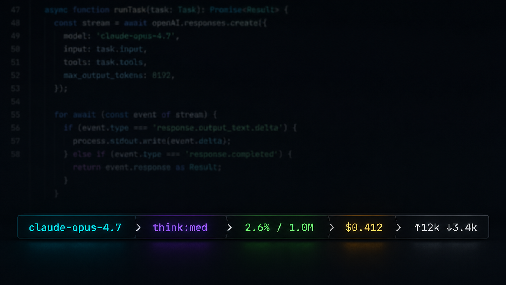
A fully customizable statusline for pi. Starship-style format templates, pluggable segments, priority-based ordering, per-segment colors, shell-command segments, and an open registry API — any extension can register its own widget. Ships with model, thinking level, context pressure, spend, and extension-status segments out of the box.
claude-opus-4.7 ❯ think:med ❯ 2.6% / 1.0M ❯ $0.412 ❯ ↑12k ↓3.4k ❯ ~/projects/app
Features
- Model awareness — never accidentally run an expensive model on a typo; the active model is always visible.
- Thinking level — instantly notice a wrong reasoning setting.
- Context pressure — usage turns green → yellow → red as you approach the window limit.
- Spend tracking — optional cost, cache-hit, and token I/O segments.
- Format templates — restyle any segment with starship-style templates:
{var}interpolation,[text](style)spans, optional groups. Drop in Nerd Font icons or emoji. - Shell-command segments — one config entry turns any command's stdout into a segment.
- Pluggable segments — any extension can register its own segment with one function call; pi-info stays a pure display layer.
- Container styling — put the bar in the footer or above/below the input box; add borders, backgrounds, alignment, padding, margins; wrap or truncate when space runs out.
- Text effects — rainbow, gradients, pulse, wave; static or animated, usable anywhere a color is. Extensions can register their own effects.
- Fully configurable — toggle, recolor, reorder, and reformat every segment from inside pi; settings persist across sessions.
Quick start
pi install npm:@sentixx/pi-info
Already running? /reload, then open the configurator:
/info
Segments
| Segment | Shows | Variables | Default format |
|---|---|---|---|
model |
Active model name | {name} {id} |
{name} |
thinking |
Reasoning level, colored by level | {level} |
think:{level} |
context |
Context usage, green → yellow → red | {percent} {window} |
{percent}% / {window} |
extensions |
Status badges set by other extensions | {key} {text} |
{key}:{text} |
billing |
Cumulative session cost | {cost} |
${cost} |
cache |
Prompt-cache hit rate | {percent} |
{percent}% |
io |
Cumulative token I/O | {input} {output} {total} |
(↑{input} )(↓{output}) |
cwd |
Working directory | {dir} |
{dir} |
branch |
Current git branch | {branch} |
{branch} |
Segments hide automatically when they have nothing to show.
Configuration
/info command
| Subcommand | What it does |
|---|---|
/info segments |
Per segment: show/hide and which bar it lives in (above / below / footer) |
/info color |
Per-segment colors — theme names or #RRGGBB |
/info order |
Reorder segments |
/info separator |
Change the separator between segments (string + color) |
/info format |
Edit per-segment format templates |
/info style |
Container style — position, border, background, alignment, overflow |
/info preset |
Apply a format preset — formats + separator (plain / minimal / bars / nerd / powerline / emoji) |
Segment visibility:
Color configuration:
Config file
Settings persist to ~/.pi/agent/pi-info.json — one object per segment:
{
"separator": { "char": "❯", "color": "dim" },
"style": { "position": "aboveEditor", "border": "rounded", "padding": 1 },
"segments": {
"model": { "format": " {name}", "color": "accent", "order": 1 },
"context": { "format": "[{percent}%](auto bold) · {window}" },
"io": false,
"weather": { "command": "curl -s 'wttr.in?format=%t'", "interval": 300 }
}
}
Per-segment keys (all optional):
| Key | Meaning |
|---|---|
format |
Template string; omit for the segment's default |
color |
Base color for untemplated text — theme name or #RRGGBB |
bg |
Segment background block — #RRGGBB or theme bg name (powerline-style) |
order |
Priority, lower = earlier (default 999) |
position |
Pin this segment to a bar (footer / aboveEditor / belowEditor); omit to follow the global style.position |
hidden |
Hide the segment; "name": false is shorthand |
command |
Shell command whose stdout becomes {output} — defines a custom segment |
interval |
Cache command output for N seconds (default 60) |
label |
Display name in /info for command segments |
Powerline look
/info preset → powerline turns every segment into a colored block joined by arrow transitions (needs a patched font). Under the hood it's two ingredients you can also mix by hand: a bg per segment, and the separator switched to powerline mode:
{
"separator": { "char": "", "mode": "powerline" },
"segments": {
"model": { "bg": "#8aadf4", "color": "#1e2030" },
"context": { "bg": "#494d64" }
}
}
In powerline mode the separator char is drawn with its foreground taken from the previous block's bg and its background from the next block's — the classic seamless transition. Segments without a bg render as plain text.
Container style
The whole bar is styled by the optional top-level style block — where it lives, what wraps it, and how it behaves when space runs out. Everything defaults to the classic footer look.
| Key | Values | Meaning |
|---|---|---|
position |
footer (default) / aboveEditor / belowEditor / editorTop / editorBottom |
Where the bar is mounted; non-footer placements replace pi's built-in footer. editorTop/editorBottom weave the content into the input box's own border rule |
align |
left (default) / center / right |
Full width: aligns the content; content width: aligns the bar |
width |
full (default) / content |
Span the terminal or shrink-wrap the segments |
overflow |
truncate (default) / wrap |
Overwide content: cut it off, or wrap onto more lines at segment boundaries |
border |
none (default) / single / rounded / double / heavy / ascii / top |
Box around the bar; top is a single rule above it |
borderColor |
theme name or #RRGGBB |
Border color (default dim) |
background |
theme bg name or #RRGGBB |
Bar background, e.g. selectedBg or #303446 |
padding |
0–8 |
Spaces between content and the border/background edge |
marginTop / marginBottom |
0–5 |
Blank lines around the bar |
/info style includes one-step presets: plain, boxed (rounded border), island (centered floating bar), top-line, above-input, below-input, merged (woven into the input box border).
Merging with the input box: editorTop / editorBottom render the bar inside the input box's own border rule instead of as a separate line — the tightest integration:
─── claude-opus-4.7 ❯ think:med ❯ 2.6% / 1.0M ────────────
hello world█
───────────────────────────────────────────────────────────
The editor's scroll indicator ("─── ↓ 2 more") takes priority over the embed when the input is scrolled. Caveat: pi has a single custom-editor slot, so this mode conflicts with other editor-replacing extensions (e.g. vim modes) — last one wins.
"style": { "align": "center", "width": "content", "border": "rounded", "padding": 1 }
        ╭─────────────────────────────────────────╮
        │ claude-opus-4.7 ❯ think:med ❯ 2.6% / 1M │
        ╰─────────────────────────────────────────╯
Splitting into multiple bars: give any segment its own position (via /info segments or the config) and the statusline splits — segments without one follow the global style.position. Bars share the container style and vanish when empty.
"segments": {
  "model":   { "position": "aboveEditor" },
  "context": { "position": "aboveEditor" }
}
claude-opus-4.7  ❯  2.6% / 1.0M     ← above the input box
──────────────────────────────────
hello world█
──────────────────────────────────
$0.412  ❯  ↑12k ↓3.4k               ← footer (everything else)
Format templates
{var}            variable interpolation
[text](style)    styled span — color (#RRGGBB / theme name), "auto",
                 and bold / italic / underline, space-separated
(group)          optional group: skipped when every {var} inside is empty
\x               escape any syntax character
auto resolves to the segment's semantic color — context keeps its
threshold color and thinking its level color even inside custom formats.
Any Unicode works: Nerd Font glyphs, emoji, powerline characters.
"context": "[{percent}%](auto) [of](dim) {window}",
"branch": "[](#f34f29) {branch}",
"io": "(⬆{input} )(⬇{output})"
Text effects
Anywhere a color is accepted — segment color, [text](style) spans, borderColor, separator color — an effect spec works too:
| Effect | Look |
|---|---|
rainbow |
hue sweep across the text |
rainbow-flow |
rainbow drifting over time (animated) |
gradient:#a..#b[..#c…] |
multi-stop gradient across the text |
gradient-flow:#a..#b[..…] |
gradient drifting over time (animated) |
pulse:#RRGGBB |
whole text breathing in brightness (animated) |
wave:#RRGGBB |
brightness wave rolling through the text (animated) |
"model":   { "color": "rainbow-flow" },
"context": { "format": "[{percent}%](gradient:#a6e3a1..#f38ba8) / {window}" }
Animated effects drive a re-render ticker that only runs while one is actually visible — static configs cost nothing. Effects are an open registry, same as segments: any extension can add its own (see Extending below).
Environment variables
| Variable | Purpose | Example |
|---|---|---|
PI_INFO_SHOW |
Startup default segments | model,context |
PI_INFO_THRESHOLDS |
Context warning,danger percentages | 70,90 |
PI_INFO_CONFIG |
Override config file path | /tmp/sl.json |
Extending: custom segments
Anything can be a segment. The zero-code path is a command entry in the config (see above). For full control, register one from any pi extension or script:
import { registerSegment } from "@sentixx/pi-info/extensions/statusline.js";

registerSegment({
	name: "review-queue",
	label: "Review Queue",
	// Expose template variables so users can reformat your segment:
	data(ctx) {
		const count = getQueueCountSomehow();
		return count > 0 ? { count: String(count) } : null; // null hides
	},
	defaultFormat: "{count} reviews",
	color: () => "#89b4fa",
});
Segments that only implement render() still work — their output is exposed to templates as {output}. Registered segments automatically appear in /info segments, color, order, and format, and their settings persist. Extensions can also surface lightweight one-off badges through pi's ctx.ui.setStatus(), which show up in the extensions segment.
Text effects use the same open-registry pattern:
import { registerEffect } from "@sentixx/pi-info/extensions/statusline.js";

registerEffect("flag", {
	// Hex color for grapheme i of n at time t (seconds).
	colorAt: (i, n) => ["#ff0000", "#ffffff", "#00aa00"][Math.floor((i / n) * 3)],
	// intervalMs: 120,  // set for animated effects
});
// users can now write "color": "flag" or [text](flag)
Custom renderer: change anything without forking
When the built-in styling options aren't enough, point the config at your own module — it takes over the final rendering of any bar or editor-border embed:
"style": { "renderer": "/home/me/.pi/my-renderer.ts" }
// my-renderer.ts — both exports optional
import type { BarRenderInput, EdgeRenderInput } from "@sentixx/pi-info/extensions/statusline.js";

export function renderBar(bar: BarRenderInput): string[] | string | null {
	if (bar.position !== "footer") return null; // null = default pipeline
	// bar.parts: [{ key, text }] colored segments in display order
	return [`>> ${bar.parts.map((p) => p.text).join(" | ")} <<`];
}

export function renderEdge(edge: EdgeRenderInput): string | null {
	// edge.rule() colors text like the input box border
	return edge.rule("═══ ") + edge.parts.map((p) => p.text).join(" · ") + edge.rule(" ═══");
}
Hooks receive fully rendered segments (parts), the separator, terminal width, theme, and the style config; return null to fall through, so you can override exactly one bar and keep the defaults elsewhere. A renderer that fails to load or throws is skipped — the statusline never breaks because of it. Combined with registerSegment / registerEffect, every layer is replaceable without touching this package.
Scope: what pi-info does and doesn't do
pi-info is a pure display layer — a terminal sink for information. The boundary, explicitly:
It does:
- Statusline appearance — container, layout, colors, effects: everything about how things look.
- Information display — read-only presentation of whatever it's given.
- Receive, never fetch — data arrives through three one-way channels: pi's own runtime state (model, context, …), the
registerSegment/registerEffectAPIs, andcommandsegments (your script's stdout).
It deliberately doesn't:
- Generate information — no computing, aggregating, or deriving new data. Everything shown must come from a source as-is (display formatting like
12000 → 12kis the only transform). - Store information — no history, no data caches, nothing written to disk except your display config (the short-lived in-memory cache of
commandoutput is render plumbing, not storage). - Couple to other plugins — the only contact surface is the one-way registry API. pi-info never imports, queries, or depends on another extension's internals; if a registrant disappears, pi-info keeps working.
- Output information — it is the end of the pipe. No query API, no events, no state for others to read.
If a feature request needs pi-info to produce, persist, or publish data, the answer is to do that in your own extension or script and hand the result to pi-info to display.
Architecture
extensions/statusline.ts   entry: event wiring, /info command, footer install
lib/
  constants.ts             segment names, labels, defaults
  config.ts                persisted per-segment config + env parsing
  template.ts              format template engine ({var}, [..](style), groups)
  colors.ts / text.ts      color + text helpers
  presets.ts               one-step format presets
  registry.ts              dynamic segment registry (registerSegment API)
  effects.ts               text effect registry (rainbow, gradients, registerEffect API)
  style.ts                 container styling (position, border, background)
  footer.ts                footer line renderer
  status-filter.ts         extension-status filtering
  configurators/           /info TUI configurators
segments/                  SegmentProvider interface + built-in providers
Roadmap
- Custom renderers — point config at your own TS module for full control over the footer line, Claude Code statusline-style.
Credits & License
MIT. Originated as a rewrite of pi-bar by Jenny Yu (MIT); see LICENSE.