harpy-theme
Harpy theme for Pi — dark (harpy-noct) and light (harpy-insone) variants inspired by the Harpy eagle, apex predator of the Amazon
Package details
Install harpy-theme from npm and Pi will load the resources declared by the package manifest.
$ pi install npm:harpy-theme- Package
harpy-theme- Version
1.2.0- Published
- Oct 2, 2026
- Downloads
- 565/mo · 509/wk
- Author
- bscordeiro
- License
- MIT
- Types
- theme
- Size
- 2.3 MB
- Dependencies
- 0 dependencies · 0 peers
Pi manifest JSON
{
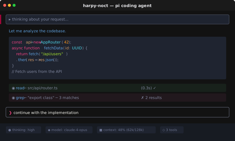
  "image": "https://raw.githubusercontent.com/bscordeiro/harpy-theme/main/assets/mockup-noct.svg",
  "themes": [
    "./themes"
  ]
}
Security note
Pi packages can execute code and influence agent behavior. Review the source before installing third-party packages.
README
Harpy-theme 🦅
Harpy theme for the pi coding agent — dark (harpy-noct) and light (harpy-insone) variants.
Inspired by the harpy eagle, apex predator of the Amazon rainforest — power, precision and elegance.
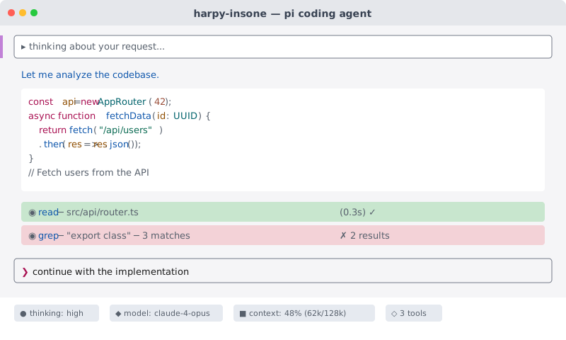
Preview
harpy-noct (dark)

harpy-insone (light)
Validation
Contrast and semantic separation are enforced by test/check-contrast.mjs:
npm testnpm test runs validator regression tests and checks both theme variants. Validation rejects malformed colors, missing required backgrounds, undefined references, and variable cycles before evaluating contrast.
Normal text tokens must pass ≥ 4.5:1 against every surface they may occupy; tertiary tokens must pass ≥ 3:1. Status hues (success/error/warning) are reserved for status semantics — syntax strings/numbers use distinct colors, and ramp levels use a violet progression instead of alarm reds.
Search uses a dedicated violet highlight, distinct from the blue selection background, with text contrast ≥ 4.5:1. Optional search colors retain Pi's text and selectedBg fallbacks. Export metadata (dim) must pass ≥ 4.5:1 on explicit pageBg and cardBg backgrounds before browser opacity is applied. The light theme uses a darker metadata gray for better legibility.
Installation
From npm:
pi install npm:harpy-themeLocal development
From a local checkout, copy the current themes into Pi's user theme directory:
npm run copy:themesThis creates ~/.pi/agent/themes if needed and replaces only harpy-noct.json and harpy-insone.json. Other themes are left unchanged. Theme sources are resolved relative to the script, not the current working directory. Copying does not publish a package or modify Pi settings.
Usage
Select via /settings or directly in the TUI:
/theme harpy-noct    # Dark variant
/theme harpy-insone  # Light variant
Signature colors
The 4 exclusive colors that make harpy-theme recognizable:
| Color | Dark | Light | Usage |
|---|---|---|---|
| 🔮 Harpy Violet | #9B8BF4 |
#7B1FA2 |
Accent, headings, selections |
| 🌸 Harpy Pink | #FA569A |
#A91152 |
Keywords, labels |
| 🦚 Harpy Teal | #6ECBD5 |
#00626B |
Types, tools, borders, bullets |
| 🌊 Harpy Blue | #5FA0DE |
#0F57AC |
Functions, links |
The dark variant keeps function blue (#5C9CE6) separate from signature link blue (#5FA0DE). Its success panels use #1A2B1E for a subtler green without lowering the existing surface-separation requirement.
The light variant uses copper (#9B4F3A) for numbers, while variables retain amber (#8E4D00), making the two roles distinguishable.
In harpy-noct, strings use warm ivory (#D8D0A8) instead of green to avoid green-on-green text in successful write/edit previews. This affects strings throughout syntax-highlighted code; success and error panels keep their green and red backgrounds.
Split-diff extensions can derive additional highlight backgrounds. Base theme contrast checks do not guarantee contrast in those regions.
Palettes
| Variant | Palette |
|---|---|
| harpy-noct | 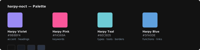 |
| harpy-insone | 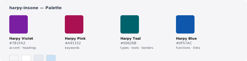 |
Surface colors
Background & surface colors (dark → light):

  Background  ████████  #121212  #F5F5F7
  Surface     ████████  #171B22  #FFFFFF
  SurfaceAlt  ████████  #232936  #E6EAF0
  Selection   ████████  #2B3445  #C9E2F6
Highlights
- 🔤 Typography — normal text validated at ≥ 4.5:1; tertiary text at ≥ 3:1
- 🌡️ Thinking ramp — cool blue → violet progression for thinking level indicators
- 🌙→☀️ Day & night — dark and light variants sharing the same visual identity
- 🦅 Brazilian identity — crafted as a pi theme, inspired by Amazon wildlife
License
MIT © bscordeiro