pi-canvas-design
Infinite design canvas & freeform visual frontend builder for pi — draw primitives, drag components, snap, and export code
Package details
Install pi-canvas-design from npm and Pi will load the resources declared by the package manifest.
$ pi install npm:pi-canvas-design- Package
pi-canvas-design- Version
2.0.1- Published
- Jul 3, 2026
- Downloads
- 170/mo · 13/wk
- Author
- biurea
- License
- MIT
- Types
- extension
- Size
- 430.8 KB
- Dependencies
- 0 dependencies · 0 peers
Pi manifest JSON
{
  "extensions": [
    "./index.ts"
  ],
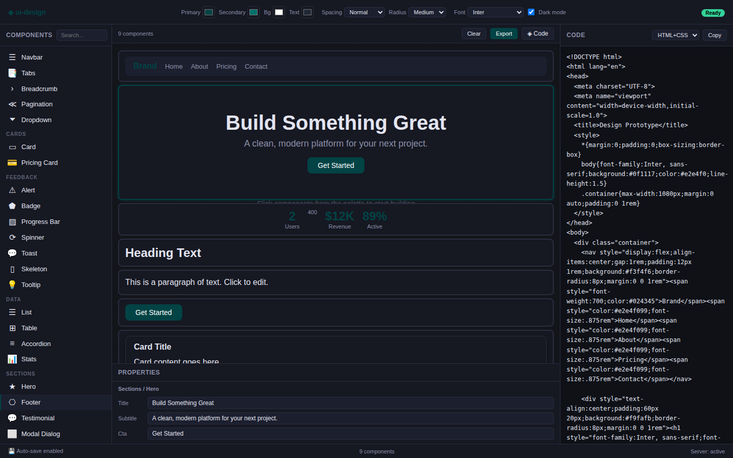
  "image": "https://raw.githubusercontent.com/b-iurea/pi-ui-design/main/docs/screenshot.png"
}
Security note
Pi packages can execute code and influence agent behavior. Review the source before installing third-party packages.
README
◈ pi-canvas-design
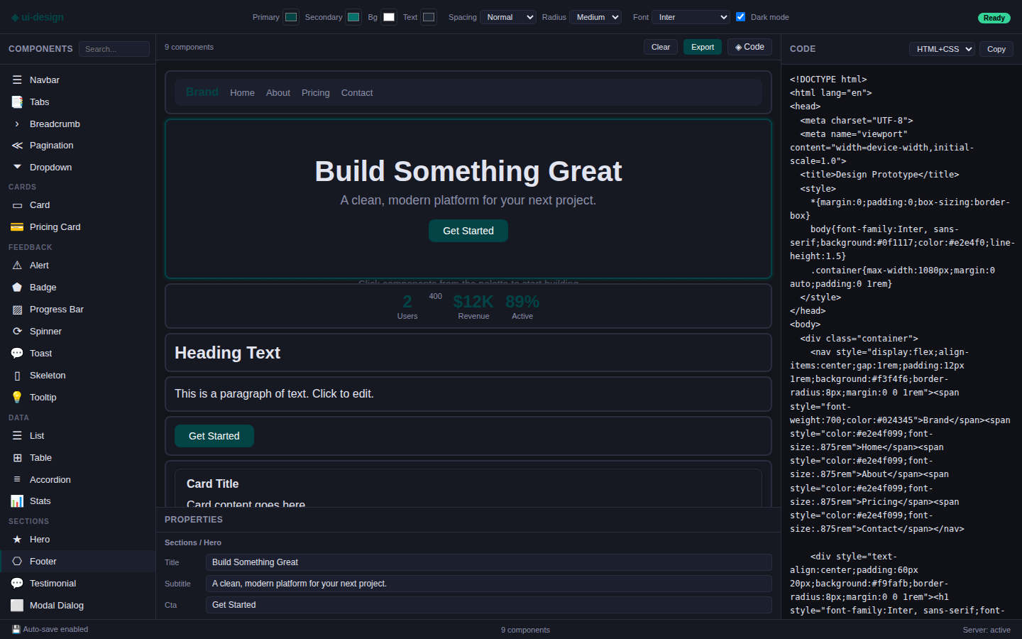
Infinite design canvas & visual frontend builder for pi. Draw, drag, theme, export — zero dependencies, runs in the browser.
/canvas-design start   → launch on http://localhost:8765
/canvas-design stop    → kill the server
/canvas-design status  → check if running
Install
Install via pi:
pi install pi-canvas-design
Or clone into your pi extensions folder:
cd ~/.pi/extensions
git clone https://github.com/b-iurea/pi-ui-design.git pi-canvas-design
Start: /canvas-design start (opens browser automatically).
What's new in v2.0.0
Complete rewrite of the canvas engine — the tool is now a Figma-like free-form canvas instead of a list-based drag-and-drop builder.
| Feature | Details |
|---|---|
| Infinite canvas | Zoom from 5% to 800%, pan freely with Hand tool or Space+drag |
| Draw primitives | Rectangle, Ellipse, Line, Text, Frame — draw directly on canvas |
| Tool toolbar | Select (V), Frame (F), Rect (R), Ellipse (O), Line (L), Text (T), Pan (H) |
| Smart snapping | Snap to grid + smart edge/center alignment guides (red SVG lines) |
| Undo / Redo | Up to 60 steps — Ctrl+Z / Ctrl+Shift+Z |
| Clipboard | Cut / Copy / Paste / Duplicate — Ctrl+X/C/V/D |
| Minimap | Live thumbnail navigator in the bottom-right corner; click or drag to pan |
| Rulers | Pixel rulers along top and left edges, toggle with Shift+R |
| Layers panel | Toggle visibility, lock, rename (double-click), delete per element |
| Rich Design panel | Fill (color + opacity), Stroke (width, style, position), Effects (drop shadow), Typography, Corner radius, Opacity, Flip H/V, Rotation |
| Rotation handle | Drag the circular handle above a selected element; Shift snaps to 15° |
| Proportional resize | Hold Shift while dragging a corner handle |
| Group | Select 2+ elements → Ctrl+G wraps them in a Frame |
| Inline text edit | Double-click a Text primitive to edit content directly on canvas |
| Fit / Zoom shortcuts | Shift+1 fit-to-screen · Shift+2 zoom-to-selection · Ctrl+0 100% |
What it does
Build a UI skeleton from a palette of 40+ components — heading, card, navbar, table, hero, modal, pricing, etc. — or draw custom shapes directly. Edit properties, change colors and spacing, then export the result. The tool auto-saves to .ui-design/ in the project root.
The generated code is available in three formats:
- HTML+CSS — standalone page with inline styles
- React JSX — component with style objects
- Tailwind — utility-first classes
The workflow
This tool is half of a two-step process:
- You draw or drag a rough prototype together in the browser — just structure, placeholder copy, and rough layout. Think of it as sketching a wireframe.
- The LLM reads it with the
read_ui_designtool and treats it as a blueprint — then builds the real, production-quality frontend with full detail, modern design, animations, real content, and responsive layout.
The prototype shows what goes where. The LLM builds what it looks like.
Layout
┌────────────────────────────────────────────────────────────┐
│  Topbar — tools · grid/snap/rulers · undo/redo · zoom      │
├──────────┬─────────────────────────────────┬───────────────┤
│ Components│                                 │ Design / Code │
│ Layers   │  Infinite Canvas                 │  panel        │
│          │  · draw primitives               │               │
│          │  · drag components               │  Fill, Stroke │
│          │  · select, resize, rotate        │  Effects      │
│          │  · smart-snap guides             │  Typography   │
│          │                        ┌──────┐  │  Pos / Size   │
│          │                        │ map  │  │               │
├──────────┴─────────────────────────┴──────┴─┴───────────────┤
│  Bottom bar — save status · element count · cursor position  │
└──────────────────────────────────────────────────────────────┘
Palette (Components tab)
Components are grouped by category: Layout, Typography, Buttons, Forms, Media, Navigation, Cards, Feedback, Data, Sections. Click to add at canvas center, or drag and drop directly onto the canvas.
Layers tab
Lists every element on the canvas. Click to select, double-click to rename, use the eye / lock / ✕ buttons to toggle visibility, lock, or delete.
Tool shortcuts
| Key | Tool |
|---|---|
| V | Select |
| F | Frame |
| R | Rectangle |
| O | Ellipse |
| L | Line |
| T | Text |
| H | Hand (pan) |
| Space+drag | Pan |
| Scroll | Zoom (centered on cursor) |
| Escape | Deselect / cancel draw |
Keyboard shortcuts
| Shortcut | Action |
|---|---|
| Ctrl+Z | Undo |
| Ctrl+Shift+Z | Redo |
| Ctrl+D | Duplicate |
| Ctrl+C / X / V | Copy / Cut / Paste |
| Ctrl+G | Group selected |
| Ctrl+A | Select all |
| Delete / Backspace | Delete selected |
| Arrow keys | Nudge 1px (Shift = 10px) |
| Shift+1 | Fit to screen |
| Shift+2 | Zoom to selection |
| Ctrl+0 | Reset zoom to 100% |
| Ctrl++ / − | Zoom in / out |
| Shift+R | Toggle rulers |
| Alt+drag | Duplicate and move |
| Shift+drag handle | Proportional resize |
Theme
| Control | What it does |
|---|---|
| Primary | Canvas accent — buttons, badges, progress bars |
| Secondary | Canvas secondary accent |
| Spacing | Compact / Normal / Spacious |
| Radius | None → XL |
| Font | Inter, Georgia, Space Grotesk, DM Sans, JetBrains Mono |
Review / Feedback
Every element on the canvas has a 💬 review button (top-left corner, visible on hover). Click it to open a popover where you can type feedback about that specific component — what should change, what looks wrong, what to improve. A Resolved checkbox lets you mark feedback as done.
The same review textarea appears in the Design panel when an element is selected. When multiple elements are selected, the panel shows a single textarea to apply a review to all of them at once.
Reviews are saved to .ui-design/reviews.json and synced between the canvas and the LLM tools automatically every 3 seconds. Elements with active unresolved reviews show an orange 💬 badge so you can spot them at a glance.
API
The plugin registers these tools:
read_ui_design— reads the prototype from.ui-design/and returns the HTML + component tree + theme. The tool description (visible to the LLM) explicitly instructs it to treat the prototype as a skeleton/blueprint and build the real frontend from it with full detail, modern design, and proper code.ui_list_components— reads the current design tree and returns every component with its id, type, name, position (x/y/w/h), props, and children. Use this to understand the current design before modifying it.ui_add_component— adds a new component to the design. Specifytype(from the 40+ palette or a primitive:rect,ellipse,line,text,frame), optionalpropsto override defaults, position (x/y), andparent_idfor nesting. Returns the new component id.ui_update_component— updates an existing component's properties (props), position (x/y), size (w/h), rotation, fill, stroke, effects, orname. Only fields you include change; omitted fields stay as-is.ui_remove_component— removes a component and all its children from the design.ui_set_theme— updates the design theme:primary,secondary,spacing,radius,font. Only included fields change.ui_review_component— adds or updates a review/feedback note on a specific component. Settextto the review content,resolved: trueto mark as done. Emptytextclears the review. The review shows as an orange 💬 badge on the canvas.ui_read_reviews— reads all review notes attached to components. Returns each review with its component name, text, and resolved status. Use this to understand what the user wants changed before updating components.build_frontend— saves the LLM-generated production frontend code to.ui-design/generated/and starts a preview server on port 8766. Opens the browser automatically. Acceptshtml, optionalcss,js, and atailwindflag (auto-injects Tailwind CDN). Passfeedbackon iterations to track change history.read_feedback— reads the feedback history from.ui-design/generated/feedback.mdplus the current generated HTML/CSS/JS. Use during iteration cycles to recall what the user asked for.
Workflows
Production frontend (build → preview → iterate)
flowchart LR
  A[Design prototype in browser] -->|read_ui_design| B[LLM reads skeleton]
  B --> C[LLM generates production frontend]
  C -->|build_frontend| D[Preview server :8766]
  D -->|User reviews in browser| E{Feedback?}
  E -->|Yes| F[User tells LLM changes]
  F -->|read_feedback + build_frontend| D
  E -->|No| G[Done]
- Sketch —
/pi: ui-design start, draw or drag components into a rough layout - Generate — ask the LLM to build the real frontend from the prototype
LLM builds via tools
flowchart LR
  A[LLM reads current design] -->|ui_list_components| B[Browser canvas]
  A -->|ui_add_component / ui_update_component| B
  B --> C{Looks good?}
  C -->|No| A
  C -->|Yes| D[build_frontend]
  D --> E[Done]
- LLM builds — calls
ui_add_component,ui_update_component,ui_set_themeto construct or refine the design step by step - Iterate — review on canvas, give the LLM feedback
- Export — call
build_frontendto generate the production frontend and preview at localhost:8766
Collaborative design (LLM builds, user reviews per component)
flowchart LR
  A[LLM reads current design] -->|ui_list_components| B[Browser canvas]
  A -->|ui_add_component / ui_update_component| B
  B -->|User adds review via 💬 button| C[reviews.json]
  C -->|ui_read_reviews| A
  A -->|ui_review_component + ui_update_component| B
  B --> D{All reviews resolved?}
  D -->|No| C
  D -->|Yes| A
  A -->|build_frontend| E[Done]
- LLM builds — calls
ui_add_component,ui_update_component,ui_set_themestep by step - User reviews — each element has a 💬 button; type feedback directly on the element that needs changing
- LLM reads — calls
ui_read_reviewsto see all notes, thenui_review_componentto respond/mark resolved - Iterate — elements with unresolved reviews keep their orange badge; once all resolved, the design is ready
- Export — call
build_frontend→ code saved and served athttp://localhost:8766
Commands
| Command | What it does |
|---|---|
/pi: ui-design start [port] |
Launch the design canvas (default port 8765) |
/pi: ui-design stop |
Kill the design canvas server |
/pi: ui-design status |
Check if design canvas is running |
/pi: ui-design preview [port] |
Start the preview server (default port 8766) |
/pi: ui-design preview-stop |
Stop the preview server |
Files
ui-design/
├── index.ts                  # pi plugin entry — server, commands, tools
├── public/
│   ├── index.html            # app shell
│   ├── style.css             # all styles
│   └── app.js                # all logic — no framework, no build
└── .ui-design/               # auto-saved designs (per project)
    ├── current.html           # last generated HTML from canvas
    ├── current-design.json    # full component tree + theme
    └── generated/             # LLM-built production frontend
        ├── index.html         # generated frontend (live preview)
        ├── style.css          # optional CSS
        ├── app.js             # optional JS
        └── feedback.md        # iteration history
Contributing
It's one HTML file, one CSS, one JS, one server. Open public/app.js and go.
Author: biurea